
このたび、Youtube動画の「アフィリエイト中学校」にウェブスターマーケティング株式会社代表のマッサーさんと出演させていただきました。

今回はマーケティングのプロであるマッサーさんをメインとして、アフィリエイターさんがマーケティングとデザインをどう捉えて、利用していけばよいのか。Webデザインが苦手なアフィリエイターはどうやってデザインを作成すると良いのか、などのポイントをお話した回になります。3回に分けて公開されていますので、「なんだか気になるぞ。」という方はぜひご覧ください。
無料特典プレゼントのその内容とは!?
「アフィ中Season3 #11〜13 デザイン編(全3回)」の動画を最後まで見てくれた視聴者の方に無料特典プレゼントするぞ!と発表させていただいたのですが、その詳細についてご案内させていただきます。
本記事で紹介する特典は「アフィリエイトサイトで使える無料ボタン素材集」です。
「自分でボタン画像が作れないの!(泣)」
「作れるけど面倒くさいから、あるやつを使いたいよ!」
という方にオススメです。
サイト作成システムSIRIUS(シリウス)やWordPress等でご利用いただけます。
ボタン画像を動かすためのHTML&CSSコードも紹介!
今回は素材の提供だけでなく、ボタン画像を動かすためのHTML&CSSのサンプルコードも紹介しています!紹介しているコードを貼り付ければ、ボタンがよこにゆらゆら揺れたりプルプル動いたりします。ボタンにアクションを加えたい方はぜひ試してみてください。
また、ボタン画像がなくても、HTMLとCSSのコードを貼るだけでボタンを表現できる方法も紹介しています。CSSだけで表現できるボタンは表記修正や更新がラクなので、こちらもぜひ試してみてください。
さっそく特典プレゼントを紹介します!
少し前置きが長かったですが…
裏で色々とお話した結果、なんと今回「Webに無料公開しちゃおう!」という話になりました!
ただ、これはあくまで動画を見てくれた人限定のプレゼントということになっているのです!まだ今回の動画を見てない人は以下のリンクから見てくださいね〜!(^o^)
さぁ、みんな見たかな??
それでは、以下より紹介させていただきます〜!
ボタンの画像素材の詳細
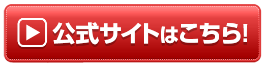
シンプルボタン1:公式サイトはこちら

他のボタンカラーバリエーション


シンプルボタン2:公式サイトはこちら

他のボタンカラーバリエーション


シンプルボタン2(キラキラ):公式サイトはこちら

他のボタンカラーバリエーション


シンプルボタン3:詳細はこちら

他のボタンカラーバリエーション


ボタンの一括ダウンロードはこちら
ボタン画像をまとめてダウンロードしたい方はこちら↓よりどうぞ
紹介したボタン画像をCSSで動かしてみよう
最初に紹介したボタン素材をCSSを使って動かしてみます。HTMLとCSSのサンプルコードを掲載していますので、ご自身のサイトでぜひ利用してみてください。
ふわふわ動くボタン
htmlとCSSは以下のように記述します。
HTML
<div class="btnAnime01">
<a href="#"><img src="https://○○○○.com/img/btn_af005.png" alt="公式サイトはこちら" /></a>
</div>
ここに書いてあるHTMLはサンプルのコードとなります。ご利用の際はご自身のサーバーに画像をアップロードし、imgタグのURLをご自身のサーバーのURLに置き換えてご利用ください。
CSS
/* btnAnime01 */

.btnAnime01 {
    -webkit-animation-name:btnAnime02;
    -webkit-animation-duration:1s;
    -webkit-animation-iteration-count:infinite;
    -webkit-animation-timing-function:ease;

    -moz-animation-name:btnAnime02;
    -moz-animation-duration:1s;
    -moz-animation-iteration-count:infinite;
    -moz-animation-timing-function:ease;
}
@-webkit-keyframes btnAnime02 {
    0% {-webkit-transform:translate(0, 0);}
    50% {-webkit-transform:translate(0, -8px);}
    100% {-webkit-transform:translate(0, 0);}
}
@-moz-keyframes btnAnime02 {
    0% {-moz-transform:translate(0, 0);}
    50% {-moz-transform:translate(0, -8px);}
    100% {-moz-transform:translate(0, 0);}
}
プルプル震えるボタン
htmlとCSSは以下のように記述します。
HTML
<div class="btnAnime02">
<a href="#"><img src="https://○○○○.com/img/btn_af003.png" alt="公式サイトはこちら" /></a>
</div>
ここに書いてあるHTMLはサンプルのコードとなります。ご利用の際はご自身のサーバーに画像をアップロードし、imgタグのURLをご自身のサーバーのURLに置き換えてご利用ください。
CSS
/* btnAnime02 */

.btnAnime02{
    animation-name: btnAnime02;
    animation-duration: 0.1s;
    animation-iteration-count: infinite;
    animation-timing-function: ease;
}

@-webkit-keyframes btnAnime02 {
    0% {-webkit-transform:translate(0, 0);}
    50% {-webkit-transform:translate(-5px, 0px);}
    100% {-webkit-transform:translate(0, 0);}
}
@-moz-keyframes btnAnime02 {
    0% {-moz-transform:translate(0, 0);}
    50% {-moz-transform:translate(-5px, 0px);}
    100% {-moz-transform:translate(0, 0);}
}
.btnAnime02:hover {
    animation: none;
}
2つの画像を動かしてややインパクトのあるボタンを作ろう
ボタンとそのテキストやカーソル等を2枚の画像にわけて違う動きを加えています。 ボタン単体の画像をを動かすよりも、よりインパクトを与えることができます。 よかったらこちらも試してみてくださいね。
文字が飛び出る&ぷるぷると動くボタン
今回は2つの画像を利用しますので、以下の画像2枚を右クリックで「名前をつけて画像を保存」を押して保存してご利用ください。
利用している画像2枚はこちら

ボタンの色を変えたい場合はこちらの画像をどうぞ


htmlとCSSは以下のように記述します。
HTML
<div class="btnAnime03" id="confirm">
   <a href="#"><img src="https://○○○○.com/img/btn_anime01_start.png" alt="公式サイトはこちら" class="btnAnime03-start"></a>
</div>
ここに書いてあるHTMLはサンプルのコードとなります。ご利用の際はご自身のサーバーに画像をアップロードし、imgタグのURLをご自身のサーバーのURLに置き換えてご利用ください。
CSS
/* btnAnime03 */

.btnAnime03 {
    background: rgba(0, 0, 0, 0) url("../img/btn_anime01.png") no-repeat scroll left top / 100% auto;
    margin: 0 auto;
    width: 100%;
    animation-duration: 4s;
    animation-iteration-count: infinite;
    animation-name: button;
    animation-timing-function: ease;
    transform: scale(1);
    transform-origin: center bottom 0;
}
.btnAnime03-start {
    animation-duration: 3.5s;
    animation-iteration-count: infinite;
    animation-name: start;
    animation-timing-function: ease;
    display: block;
    height: auto;
    left: 0;
    top: 0;
    width: 100%;
}

@keyframes start {
    0%, 100%, 20%, 8% {opacity: 1;transform: scale(1);}
    12% {opacity: 1;transform: scale(1.2);}
    16% {opacity: 1;transform: scale(0.9);}
}

@keyframes button {
    28%, 48% {transform: skew(0deg);}
    32% {transform: skew(10deg);}
    36% {transform: skew(-10deg);}
    40% {transform: skew(5deg);}
    44% {transform: skew(-5deg);}
}
CSS内のbackgroundに記載する画像のパスはご自身のサーバーのURLに置き換えてご利用ください。
左右に矢印が動く&ぷるぷると動くボタン
 今回は以下の2つの画像を利用します。
利用している画像2枚はこちら
htmlとCSSは以下のように記述します。
HTML
<a class="btnAnime04" href="#"><img class="btnAnime04-arrow" src="https://○○○○.com/img/btn_arrow1.png" alt="" /><img class="btnAnime04-animate" src="https://○○○○.com/img/btn_plnpln5.png" alt="公式サイトはこちら" /></a>
ここに書いてあるHTMLはサンプルのコードとなります。ご利用の際はご自身のサーバーに画像をアップロードし、imgタグのURLをご自身のサーバーのURLに置き換えてご利用ください。
CSS
/* btnAnime04 */

@-moz-keyframes plnpln1 {
    0% { -moz-transform: skewX(9deg); }
    10% { -moz-transform: skewX(-8deg); }
    20% { -moz-transform: skewX(7deg); }
    30% { -moz-transform: skewX(-6deg); }
    40% { -moz-transform: skewX(5deg); }
    50% { -moz-transform: skewX(-4deg); }
    60% { -moz-transform: skewX(3deg); }
    70% { -moz-transform: skewX(-2deg); }
    80% { -moz-transform: skewX(1deg); }
    90% { -moz-transform: skewX(0deg); }
    100% { -moz-transform: skewX(0deg); }
}

@-o-keyframes plnpln1 {
    0% { -o-transform: skewX(9deg); }
    10% { -o-transform: skewX(-8deg); }
    20% { -o-transform: skewX(7deg); }
    30% { -o-transform: skewX(-6deg); }
    40% { -o-transform: skewX(5deg); }
    50% { -o-transform: skewX(-4deg); }
    60% { -o-transform: skewX(3deg); }
    70% { -o-transform: skewX(-2deg); }
    80% { -o-transform: skewX(1deg); }
    90% { -o-transform: skewX(0deg); }
    100% { -o-transform: skewX(0deg); }
}

@-webkit-keyframes plnpln1 {
    0% { -webkit-transform: skewX(9deg); }
    10% { -webkit-transform: skewX(-8deg); }
    20% { -webkit-transform: skewX(7deg); }
    30% { -webkit-transform: skewX(-6deg); }
    40% { -webkit-transform: skewX(5deg); }
    50% { -webkit-transform: skewX(-4deg); }
    60% { -webkit-transform: skewX(3deg); }
    70% { -webkit-transform: skewX(-2deg); }
    80% { -webkit-transform: skewX(1deg); }
    90% { -webkit-transform: skewX(0deg); }
    100% { -webkit-transform: skewX(0deg); }
}

@-moz-keyframes arrow1 {
    0% { -moz-transform: translateX(0px); }
    45% { -moz-transform: translateX(20px); }
    50% { -moz-transform: translateX(25px); }
    55% { -moz-transform: translateX(20px); }
    95% { -moz-transform: translateX(0px); }
    100% { -moz-transform: translateX(0px); }
}

@-o-keyframes arrow1 {
    0% { -o-transform: translateX(0px); }
    45% { -o-transform: translateX(20px); }
    50% { -o-transform: translateX(25px); }
    55% { -o-transform: translateX(20px); }
    95% { -o-transform: translateX(0px); }
    100% { -o-transform: translateX(0px); }
}

@-webkit-keyframes arrow1 {
    0% { -webkit-transform: translateX(0px); }
    45% { -webkit-transform: translateX(20px); }
    50% { -webkit-transform: translateX(25px); }
    55% { -webkit-transform: translateX(20px); }
    95% { -webkit-transform: translateX(0px); }
    100% { -webkit-transform: translateX(0px); }
}
.btnAnime04 {
    position: relative;
    display:block;
    width:100%;
    max-width:600px;
    padding:10px;
    padding-left:10%;
    -webkit-box-sizing: border-box;
    -moz-box-sizing: border-box;
    box-sizing: border-box;
    margin-left:auto;
    margin-right:auto;
}
.btnAnime04-animate{
    -webkit-animation-duration:2s;
    -moz-animation-duration:2s;
    -ms-animation-duration:2s;
    -o-animation-duration:2s;
    animation-duration:2s;

    -webkit-animation-timing-function: ease-in;
    -moz-animation-timing-function: ease-in;
    -o-animation-timing-function: ease-in;
    animation-timing-function: ease-in;

    -webkit-animation-iteration-count: infinite;
    -moz-animation-iteration-count: infinite;
    -o-animation-iteration-count: infinite;
    -ms-animation-iteration-count: infinite;
    animation-iteration-count: infinite;

    margin-left:auto;
    margin-right:auto;
    z-index: 8;

    -webkit-animation-name: plnpln1;
    -moz-animation-name: plnpln1;
    -o-animation-name: plnpln1;
    animation-name: plnpln1;
    width:100%;
}
.btnAnime04-arrow {
    position: absolute;
    top:25%;
    left:-5px;
    -webkit-animation-duration:1s;
    -moz-animation-duration:1s;
    -ms-animation-duration:1s;
    -o-animation-duration:1s;
    animation-duration:1s;

    -webkit-animation-timing-function: ease-in;
    -moz-animation-timing-function: ease-in;
    -o-animation-timing-function: ease-in;
    animation-timing-function: ease-in;

    -webkit-animation-iteration-count: infinite;
    -moz-animation-iteration-count: infinite;
    -o-animation-iteration-count: infinite;
    -ms-animation-iteration-count: infinite;
    animation-iteration-count: infinite;

    -webkit-animation-name: arrow1;
    -moz-animation-name: arrow1;
    -o-animation-name: arrow1;
    animation-name: arrow1;
    z-index: 9;
    width:20%;
    max-width:100px;
}
.btnAnime04:hover img{
    opacity:1;
}
応用例:キラキラボタン
応用例として、ボタンを「キラキラボタン」に置き換えたものです。ややインパクトがプラスされますね。美容系の商品を紹介する時などに良いかもしれません。
画像を使わずCSSだけで作るボタン
画像を使わずCSSだけで作るボタンのサンプルコードの紹介です。CSSだけでボタンを作るとボタンのテキスト修正など、管理が楽なのでオススメです。 ※CSSが苦手な人は画像ボタンの方をご利用くださいね。
キラッと光るボタン:赤
キラッと一瞬光るボタン(赤)です。 → 好きな文字でどうぞ
HTML
今回はwebフォントを利用していますので、HTMLの<head>内に以下を記載し、Webフォントを読み込みます。
<link href="https://fonts.googleapis.com/earlyaccess/roundedmplus1c.css" rel="stylesheet" />
ボタンのhtmlは以下の通りです。
→ 好きな文字でどうぞ
CSS
/*web font*/
.wf-roundedmplus1c { font-family: "Rounded Mplus 1c";font-weight: 800; }

/*kirabutton01*/
.kirabutton01{
    display: block;
    width: 70%;
    margin: 20px auto;
    border-bottom: 8px solid #900;
    border-radius: 10px;
    background: linear-gradient(#f44, #f00);
    background-color: #f00;
    color: #ffffff;
    padding: 20px 10px;
    font-size:30px;
    text-align: center;
    text-decoration: none;
    position: relative;
    z-index: 2;
    overflow: hidden;
    transition: .25s linear;
    -webkit-transition: .25s linear;
    -moz-transition: .25s linear;
}
.kirabutton01:before {
    display: block;
    position: absolute;
    z-index: -1;
    left: -30%;
    top: -50%;
    content: "";
    width: 30px;
    height: 200px;
    transform: rotate(45deg);
    -webkit-transform: rotate(45deg);
    -moz-transform: rotate(45deg);
    background-image: linear-gradient(left, rgba(255,255,255,0) 0%, rgba(255,255,255,1) 50%,rgba(255,255,255,0) 100%);
    background-image: -webkit-gradient(linear, left bottom, right bottom, color-stop(0%,rgba(255,255,255,0)), color-stop(50%,rgba(255,255,255,1)),color-stop(100%,rgba(255,255,255,0)));
    background-image: -moz-linear-gradient(left, rgba(255,255,255,0) 0%, #ffffff rgba(255,255,255,1),rgba(255,255,255,0) 100%);
    animation: KiraKira1 3s infinite linear;
    -webkit-animation: KiraKira1 3s infinite linear;
    -moz-animation: KiraKira1 3s infinite linear;
}
@keyframes KiraKira1 {
    0% {left: -30%;}
    20% {left: 120%;}
    100% {left: 120%;}
}
@-webkit-keyframes KiraKira1 {
    0% {left: -30%;}
    20% {left: 120%;}
    100% {left: 120%;}
}
@-moz-keyframes KiraKira1 {
    0% {left: -30%;}
    20% {left: 120%;}
    100% {left: 120%;}
}
@media only screen and (max-width: 480px) {
.kirabutton01{
    width: 90%;
    font-size:24px;
    }
}
キラッと光るボタン:緑
キラッと一瞬光るボタン(緑)です。 → 好きな文字でどうぞ
HTML
webフォントを利用していますので、HTMLの<head>内に以下を記載し、Webフォントを読み込みます。
<link href="https://fonts.googleapis.com/earlyaccess/roundedmplus1c.css" rel="stylesheet" />
ボタンのhtmlは以下の通りです。
→ 好きな文字でどうぞ
CSS
/*web font*/
.wf-roundedmplus1c { font-family: "Rounded Mplus 1c";font-weight: 800; }

/*kirabutton02*/
.kirabutton02{
    display: block;
    width: 70%;
    margin: 20px auto;
    border-bottom: 8px solid #1D6B01;
    border-radius: 10px;
    background: linear-gradient(#70BB3A, #53A006);
    background-color: #53A006;
    color: #ffffff;
    padding: 20px 10px;
    font-size:30px;
    text-align: center;
    text-decoration: none;
    position: relative;
    z-index: 2;
    overflow: hidden;
    transition: .25s linear;
    -webkit-transition: .25s linear;
    -moz-transition: .25s linear;
}
.kirabutton02:before {
    display: block;
    position: absolute;
    z-index: -1;
    left: -30%;
    top: -50%;
    content: "";
    width: 30px;
    height: 200px;
    transform: rotate(45deg);
    -webkit-transform: rotate(45deg);
    -moz-transform: rotate(45deg);
    background-image: linear-gradient(left, rgba(255,255,255,0) 0%, rgba(255,255,255,1) 50%,rgba(255,255,255,0) 100%);
    background-image: -webkit-gradient(linear, left bottom, right bottom, color-stop(0%,rgba(255,255,255,0)), color-stop(50%,rgba(255,255,255,1)),color-stop(100%,rgba(255,255,255,0)));
    background-image: -moz-linear-gradient(left, rgba(255,255,255,0) 0%, #ffffff rgba(255,255,255,1),rgba(255,255,255,0) 100%);
    animation: KiraKira2 3s infinite linear;
    -webkit-animation: KiraKira2 3s infinite linear;
    -moz-animation: KiraKira2 3s infinite linear;
}
@keyframes KiraKira2 {
    0% {left: -30%;}
    20% {left: 120%;}
    100% {left: 120%;}
}
@-webkit-keyframes KiraKira2 {
    0% {left: -30%;}
    20% {left: 120%;}
    100% {left: 120%;}
}
@-moz-keyframes KiraKira2 {
    0% {left: -30%;}
    20% {left: 120%;}
    100% {left: 120%;}
}
@media only screen and (max-width: 480px) {
.kirabutton02{
    width: 90%;
    font-size:24px;
    }
}
キラッと光るボタン:オレンジ
キラッと一瞬光るボタン(オレンジ)です。 → 好きな文字でどうぞ
HTML
webフォントを利用していますので、HTMLの<head>内に以下を記載し、Webフォントを読み込みます。
<link href="https://fonts.googleapis.com/earlyaccess/roundedmplus1c.css" rel="stylesheet" />
ボタンのhtmlは以下の通りです。
→ 好きな文字でどうぞ
CSS
/*web font*/
.wf-roundedmplus1c { font-family: "Rounded Mplus 1c";font-weight: 800; }

/*kirabutton03*/
.kirabutton03{
    display: block;
    width: 70%;
    margin: 20px auto;
    border-bottom: 8px solid #993B30;
    border-radius: 10px;
    background: linear-gradient(#FF9500, #FF5E3A);
    background-color: #FF9500;
    color: #ffffff;
    padding: 20px 10px;
    font-size:30px;
    text-align: center;
    text-decoration: none;
    position: relative;
    z-index: 2;
    overflow: hidden;
    transition: .25s linear;
    -webkit-transition: .25s linear;
    -moz-transition: .25s linear;
}
.kirabutton03:before {
    display: block;
    position: absolute;
    z-index: -1;
    left: -30%;
    top: -50%;
    content: "";
    width: 30px;
    height: 200px;
    transform: rotate(45deg);
    -webkit-transform: rotate(45deg);
    -moz-transform: rotate(45deg);
    background-image: linear-gradient(left, rgba(255,255,255,0) 0%, rgba(255,255,255,1) 50%,rgba(255,255,255,0) 100%);
    background-image: -webkit-gradient(linear, left bottom, right bottom, color-stop(0%,rgba(255,255,255,0)), color-stop(50%,rgba(255,255,255,1)),color-stop(100%,rgba(255,255,255,0)));
    background-image: -moz-linear-gradient(left, rgba(255,255,255,0) 0%, #ffffff rgba(255,255,255,1),rgba(255,255,255,0) 100%);
    animation: KiraKira3 3s infinite linear;
    -webkit-animation: KiraKira3 3s infinite linear;
    -moz-animation: KiraKira3 3s infinite linear;
}
@keyframes KiraKira3 {
    0% {left: -30%;}
    20% {left: 120%;}
    100% {left: 120%;}
}
@-webkit-keyframes KiraKira3 {
    0% {left: -30%;}
    20% {left: 120%;}
    100% {left: 120%;}
}
@-moz-keyframes KiraKira3 {
    0% {left: -30%;}
    20% {left: 120%;}
    100% {left: 120%;}
}
@media only screen and (max-width: 480px) {
.kirabutton03{
    width: 90%;
    font-size:24px;
    }
}
キラッと光るグラデーションボタン:赤
キラッと光るグラデーションボタン(赤)です。 「キラッと光るボタン1」とそこまで大差はないですがこちらはグラデーションを動かしているので表現がやや穏やかかもしれません。 フォントやカラーなども少し変えているのでお好みでご利用ください。
→好きな文字でどうぞ
HTML
webフォントを利用していますので、HTMLの<head>内に以下を記載し、Webフォントを読み込みます。
<link href="https://fonts.googleapis.com/earlyaccess/mplus1p.css" rel="stylesheet" />
ボタンのhtmlは以下の通りです。
→好きな文字でどうぞ
CSS
/*web font*/
.wf-mplus1p { font-family: "Mplus 1p";font-weight: 900; }

/* gurabtn1 */
.gurabtn1{
    display: block;
    width: 70%;
    margin: 20px auto;
    padding: 20px 10px;
    border-radius: 10px;
    border-bottom: 8px solid #900;
    color: #ffffff;
    font-size:32px;
    text-align: center;
    text-decoration: none;
    text-shadow: 0 1px 1px #000;
  background: linear-gradient(45deg, red, red, red, red, red, OrangeRed, orange, OrangeRed, red, red, red, red, red);
  background-color:#EB5350;
  background-size: 500% 500%;
  animation: guraBtn 2s ease infinite;
}
@keyframes guraBtn {
    0%{background-position:0% 50%}
    100%{background-position:100% 50%}
}
@media only screen and (max-width: 480px) {
.gurabtn1{
    width: 90%;
    font-size:24px;
    }
}
キラッと光るグラデーションボタン:ピンク
キラッと光るグラデーションボタン(ピンク)です。 →好きな文字でどうぞ
HTML
webフォントを利用していますので、HTMLの<head>内に以下を記載し、Webフォントを読み込みます。
<link href="https://fonts.googleapis.com/earlyaccess/mplus1p.css" rel="stylesheet" />
ボタンのhtmlは以下の通りです。
→好きな文字でどうぞ
CSS
/*web font*/
.wf-mplus1p { font-family: "Mplus 1p";font-weight: 900; }

/* gurabtn2 */
.gurabtn2{
    display: block;
    width: 70%;
    margin: 20px auto;
    padding: 20px 10px;
    border-radius: 10px;
    border-bottom: 8px solid #900;
    color: #ffffff;
    font-size:32px;
    text-align: center;
    text-decoration: none;
    text-shadow: 0 1px 1px #000;
  background: linear-gradient(45deg, #FF1493, #FF1493, #FF1493, #FF1493, #FF1493, #FF1493, pink, #FF1493, #FF1493, #FF1493, #FF1493, #FF1493, #FF1493);
  background-color:#f00;
  background-size: 500% 500%;
  animation: guraBtn2 2s ease infinite;
}
@keyframes guraBtn2 {
    0%{background-position:0% 50%}
    100%{background-position:100% 50%}
}
@media only screen and (max-width: 480px) {
.gurabtn2{
    width: 90%;
    font-size:24px;
    }
}
キラッと光るグラデーションボタン:水色
キラッと光るグラデーションボタン(水色)です。 →好きな文字でどうぞ
HTML
webフォントを利用していますので、HTMLの<head>内に以下を記載し、Webフォントを読み込みます。
<link href="https://fonts.googleapis.com/earlyaccess/mplus1p.css" rel="stylesheet" />
ボタンのhtmlは以下の通りです。
→好きな文字でどうぞ
CSS
/*web font*/
.wf-mplus1p { font-family: "Mplus 1p";font-weight: 900; }

/* gurabtn3 */
.gurabtn3{
    display: block;
    width: 70%;
    margin: 20px auto;
    padding: 20px 10px;
    border-radius: 10px;
    border-bottom: 8px solid #2D79B5;
    color: #ffffff;
    font-size:32px;
    text-align: center;
    text-decoration: none;
    text-shadow: 0 1px 1px #000;
  background: linear-gradient(45deg, #29A7E1, #29A7E1, #29A7E1, #29A7E1, #29A7E1, #29A7E1, LightCyan, #29A7E1, #29A7E1, #29A7E1, #29A7E1, #29A7E1, #29A7E1);
  background-color:#f00;
  background-size: 500% 500%;
  animation: guraBtn3 2s ease infinite;
}
@keyframes guraBtn3 {
    0%{background-position:0% 50%}
    100%{background-position:100% 50%}
}
@media only screen and (max-width: 480px) {
.gurabtn3{
    width: 90%;
    font-size:24px;
    }
}
矢印とボタンがそれぞれ別の動きをする:青
矢印とボタンがそれぞれ別の動きをする(青)です。CSSでグラデーションボタンを作成し、ボタンと矢印をそれぞれ揺らしています。
→好きな文字でどうぞ
HTML
webフォントを利用していますので、HTMLの<head>内に以下を記載し、Webフォントを読み込みます。
<link href="https://fonts.googleapis.com/earlyaccess/mplus1p.css" rel="stylesheet" />
ボタンのhtmlは以下の通りです。
→好きな文字でどうぞ
CSS
/*web font*/
.wf-mplus1p { font-family: "Mplus 1p";font-weight: 900; }

/* yurabutton1 */
.yurabutton1 {
    display: block;
    width: 70%;
    margin: 20px auto;
    border-bottom: 8px solid #1A61B8;
    border-radius: 10px;

    background: #1e5799;
    background: -moz-linear-gradient(top, #1e5799 0%, #2989d8 50%, #207cca 51%, #7db9e8 100%);
    background: -webkit-linear-gradient(top, #1e5799 0%,#2989d8 50%,#207cca 51%,#7db9e8 100%);
    background: linear-gradient(to bottom, #1e5799 0%,#2989d8 50%,#207cca 51%,#7db9e8 100%);
    filter: progid:DXImageTransform.Microsoft.gradient( startColorstr='#1e5799', endColorstr='#7db9e8',GradientType=0 );

    color: #ffffff;
    padding: 20px 5px;
    font-size:32px;
    text-align: center;
    text-decoration: none;

    animation-duration: 4s;
    animation-iteration-count: infinite;
    animation-name: yurabutton1;
    animation-timing-function: ease;
    transform: scale(1);
    transform-origin: center bottom 0;
}
@keyframes yurabutton1 {
  0% { transform: scale(1.0, 1.0) translate(0%, 0%); }
  88% { transform: scale(1.0, 1.0) translate(0%, 0%); }
  90%  { transform: scale(1.0, 1.05) translate(0%, -3%); }
  92%  { transform: scale(1.05, 0.95) translate(0%, 3%); }
  94%  { transform: scale(1.0, 1.05) translate(0%, -3%); }
  96%  { transform: scale(1.05, 0.95) translate(0%, 3%); }
  98%  { transform: scale(1.0, 1.0) translate(0%, 0%); }
  100% { transform: scale(1.0, 1.0) translate(0%, 0%); }
}
@media only screen and (max-width: 480px) {
.yurabutton1{
    width: 90%;
    font-size:24px;
    }
}
.yurearrow1{
    color:yellow;
    display: inline-block;
    padding-right:10px;
    position: relative;
    animation-duration: 1s;
    animation-iteration-count: infinite;
    animation-name: yurearrow1;
    animation-timing-function: ease;
    transform: scale(1);
    transform-origin: center bottom 0;
}
@keyframes yurearrow1{
        0% { left: 0px;}
        25% { left: 5px; }
        50% { left: 0px; }
        75% { left: 5px; }
        100% { left: 0px;}
}
矢印とボタンがそれぞれ別の動きをする:紫
矢印が左右にボタンが上下にゆれる(紫)です。
→好きな文字でどうぞ
HTML
webフォントを利用していますので、HTMLの<head>内に以下を記載し、Webフォントを読み込みます。
<link href="https://fonts.googleapis.com/earlyaccess/mplus1p.css" rel="stylesheet" />
ボタンのhtmlは以下の通りです。
→好きな文字でどうぞ
CSS
/*web font*/
.wf-mplus1p { font-family: "Mplus 1p";font-weight: 900; }

/* yurabutton2 */
.yurabutton2 {
    display: block;
    width: 70%;
    margin: 20px auto;
    border-bottom: 8px solid #a80077;
    border-radius: 10px;

    background: #cb60b3;
    background: -moz-linear-gradient(top, #cb60b3 0%, #c146a1 50%, #a80077 51%, #db36a4 100%);
    background: -webkit-linear-gradient(top, #cb60b3 0%,#c146a1 50%,#a80077 51%,#db36a4 100%);
    background: linear-gradient(to bottom, #cb60b3 0%,#c146a1 50%,#a80077 51%,#db36a4 100%);
    filter: progid:DXImageTransform.Microsoft.gradient( startColorstr='#cb60b3', endColorstr='#db36a4',GradientType=0 );

    color: #ffffff;
    padding: 20px 5px;
    font-size:32px;
    text-align: center;
    text-decoration: none;

    animation-duration: 4s;
    animation-iteration-count: infinite;
    animation-name: yurabutton2;
    animation-timing-function: ease;
    transform: scale(1);
    transform-origin: center bottom 0;
}
@keyframes yurabutton2 {
  0% { transform: scale(1.0, 1.0) translate(0%, 0%); }
  88% { transform: scale(1.0, 1.0) translate(0%, 0%); }
  90%  { transform: scale(1.0, 1.05) translate(0%, -3%); }
  92%  { transform: scale(1.05, 0.95) translate(0%, 3%); }
  94%  { transform: scale(1.0, 1.05) translate(0%, -3%); }
  96%  { transform: scale(1.05, 0.95) translate(0%, 3%); }
  98%  { transform: scale(1.0, 1.0) translate(0%, 0%); }
  100% { transform: scale(1.0, 1.0) translate(0%, 0%); }
}
@media only screen and (max-width: 480px) {
.yurabutton2{
    width: 90%;
    font-size:24px;
    }
}
.yurearrow1{
    color:yellow;
    display: inline-block;
    padding-right:10px;
    position: relative;
    animation-duration: 1s;
    animation-iteration-count: infinite;
    animation-name: yurearrow1;
    animation-timing-function: ease;
    transform: scale(1);
    transform-origin: center bottom 0;
}
@keyframes yurearrow1{
        0% { left: 0px;}
        25% { left: 5px; }
        50% { left: 0px; }
        75% { left: 5px; }
        100% { left: 0px;}
}
矢印とボタンがそれぞれ別の動きをする:赤
矢印が左右にボタンが上下にゆれる(赤)です。
→好きな文字でどうぞ
HTML
webフォントを利用していますので、HTMLの<head>内に以下を記載し、Webフォントを読み込みます。
<link href="https://fonts.googleapis.com/earlyaccess/mplus1p.css" rel="stylesheet" />
ボタンのhtmlは以下の通りです。
→好きな文字でどうぞ
CSS
/*web font*/
.wf-mplus1p { font-family: "Mplus 1p";font-weight: 900; }

/* yurabutton3 */
.yurabutton3 {
    display: block;
    width: 70%;
    margin: 20px auto;
    border-bottom: 8px solid #900;
    border-radius: 10px;

    background: #f85032;
    background: -moz-linear-gradient(top, #f85032 0%, #f16f5c 50%, #f6290c 51%, #f02f17 71%, #e73827 100%);
    background: -webkit-linear-gradient(top, #f85032 0%,#f16f5c 50%,#f6290c 51%,#f02f17 71%,#e73827 100%);
    background: linear-gradient(to bottom, #f85032 0%,#f16f5c 50%,#f6290c 51%,#f02f17 71%,#e73827 100%);
    filter: progid:DXImageTransform.Microsoft.gradient( startColorstr='#f85032', endColorstr='#e73827',GradientType=0 );

    color: #ffffff;
    padding: 20px 5px;
    font-size:32px;
    text-align: center;
    text-decoration: none;

    animation-duration: 4s;
    animation-iteration-count: infinite;
    animation-name: yurabutton3;
    animation-timing-function: ease;
    transform: scale(1);
    transform-origin: center bottom 0;
}
@keyframes yurabutton3 {
  0% { transform: scale(1.0, 1.0) translate(0%, 0%); }
  88% { transform: scale(1.0, 1.0) translate(0%, 0%); }
  90%  { transform: scale(1.0, 1.05) translate(0%, -3%); }
  92%  { transform: scale(1.05, 0.95) translate(0%, 3%); }
  94%  { transform: scale(1.0, 1.05) translate(0%, -3%); }
  96%  { transform: scale(1.05, 0.95) translate(0%, 3%); }
  98%  { transform: scale(1.0, 1.0) translate(0%, 0%); }
  100% { transform: scale(1.0, 1.0) translate(0%, 0%); }
}
@media only screen and (max-width: 480px) {
.yurabutton3{
    width: 90%;
    font-size:24px;
    }
}
.yurearrow1{
    color:yellow;
    display: inline-block;
    padding-right:10px;
    position: relative;
    animation-duration: 1s;
    animation-iteration-count: infinite;
    animation-name: yurearrow1;
    animation-timing-function: ease;
    transform: scale(1);
    transform-origin: center bottom 0;
}
@keyframes yurearrow1{
        0% { left: 0px;}
        25% { left: 5px; }
        50% { left: 0px; }
        75% { left: 5px; }
        100% { left: 0px;}
}
矢印とボタンがそれぞれ別の動きをする:緑
矢印が左右にボタンが上下にゆれる(緑)です。
→好きな文字でどうぞ
HTML
webフォントを利用していますので、HTMLの<head>内に以下を記載し、Webフォントを読み込みます。
<link href="https://fonts.googleapis.com/earlyaccess/mplus1p.css" rel="stylesheet" />
ボタンのhtmlは以下の通りです。
→好きな文字でどうぞ
CSS
/*web font*/
.wf-mplus1p { font-family: "Mplus 1p";font-weight: 900; }

/* yurabutton4 */
.yurabutton4 {
    display: block;
    width: 70%;
    margin: 20px auto;
    border-bottom: 8px solid #53A006;
    border-radius: 10px;

    background: #bfd255;
    background: -moz-linear-gradient(top, #bfd255 0%, #8eb92a 50%, #72aa00 51%, #9ecb2d 100%);
    background: -webkit-linear-gradient(top, #bfd255 0%,#8eb92a 50%,#72aa00 51%,#9ecb2d 100%);
    background: linear-gradient(to bottom, #bfd255 0%,#8eb92a 50%,#72aa00 51%,#9ecb2d 100%);
    filter: progid:DXImageTransform.Microsoft.gradient( startColorstr='#bfd255', endColorstr='#9ecb2d',GradientType=0 );

    color: #ffffff;
    padding: 20px 5px;
    font-size:32px;
    text-align: center;
    text-decoration: none;

    animation-duration: 4s;
    animation-iteration-count: infinite;
    animation-name: yurabutton4;
    animation-timing-function: ease;
    transform: scale(1);
    transform-origin: center bottom 0;
}
@keyframes yurabutton4 {
  0% { transform: scale(1.0, 1.0) translate(0%, 0%); }
  88% { transform: scale(1.0, 1.0) translate(0%, 0%); }
  90%  { transform: scale(1.0, 1.05) translate(0%, -3%); }
  92%  { transform: scale(1.05, 0.95) translate(0%, 3%); }
  94%  { transform: scale(1.0, 1.05) translate(0%, -3%); }
  96%  { transform: scale(1.05, 0.95) translate(0%, 3%); }
  98%  { transform: scale(1.0, 1.0) translate(0%, 0%); }
  100% { transform: scale(1.0, 1.0) translate(0%, 0%); }
}
@media only screen and (max-width: 480px) {
.yurabutton4{
    width: 90%;
    font-size:24px;
    }
}
.yurearrow1{
    color:yellow;
    display: inline-block;
    padding-right:10px;
    position: relative;
    animation-duration: 1s;
    animation-iteration-count: infinite;
    animation-name: yurearrow1;
    animation-timing-function: ease;
    transform: scale(1);
    transform-origin: center bottom 0;
}
@keyframes yurearrow1{
        0% { left: 0px;}
        25% { left: 5px; }
        50% { left: 0px; }
        75% { left: 5px; }
        100% { left: 0px;}
}
さいごに
ボタンの紹介は以上になります。
みなさまのアフィリエイトサイト制作に役立てていただければ幸いです。 最後までお読みいただきありがとうございました!
何かありましたら@_yonecoまでご連絡いただければと思います。(もしリクエストなどある場合、言っていただければ追加するかもしれません)
それではみなさん良いアフィリエイトライフを!(^o^)


